Acura: Total Control
To create hype around the launch of Acura’s 2019 ILX model, we partnered with Acura and Mullenlowe to create the Total Control experience…
To create hype around the launch of Acura’s 2019 ILX model, we partnered with Acura and Mullenlowe to create the Total Control experience.
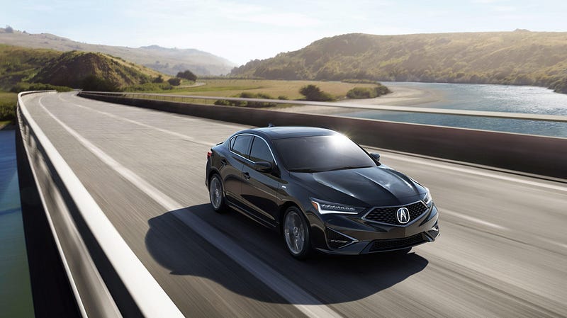
The 2019 ILX boasts to be ‘quick on its feet’, meaning that for its size, it’s one of the most powerful and agile vehicles in its class. As such, we set out to build something that demonstrated its reactiveness and sportiness in an engaging and exciting way.
The Starting Point
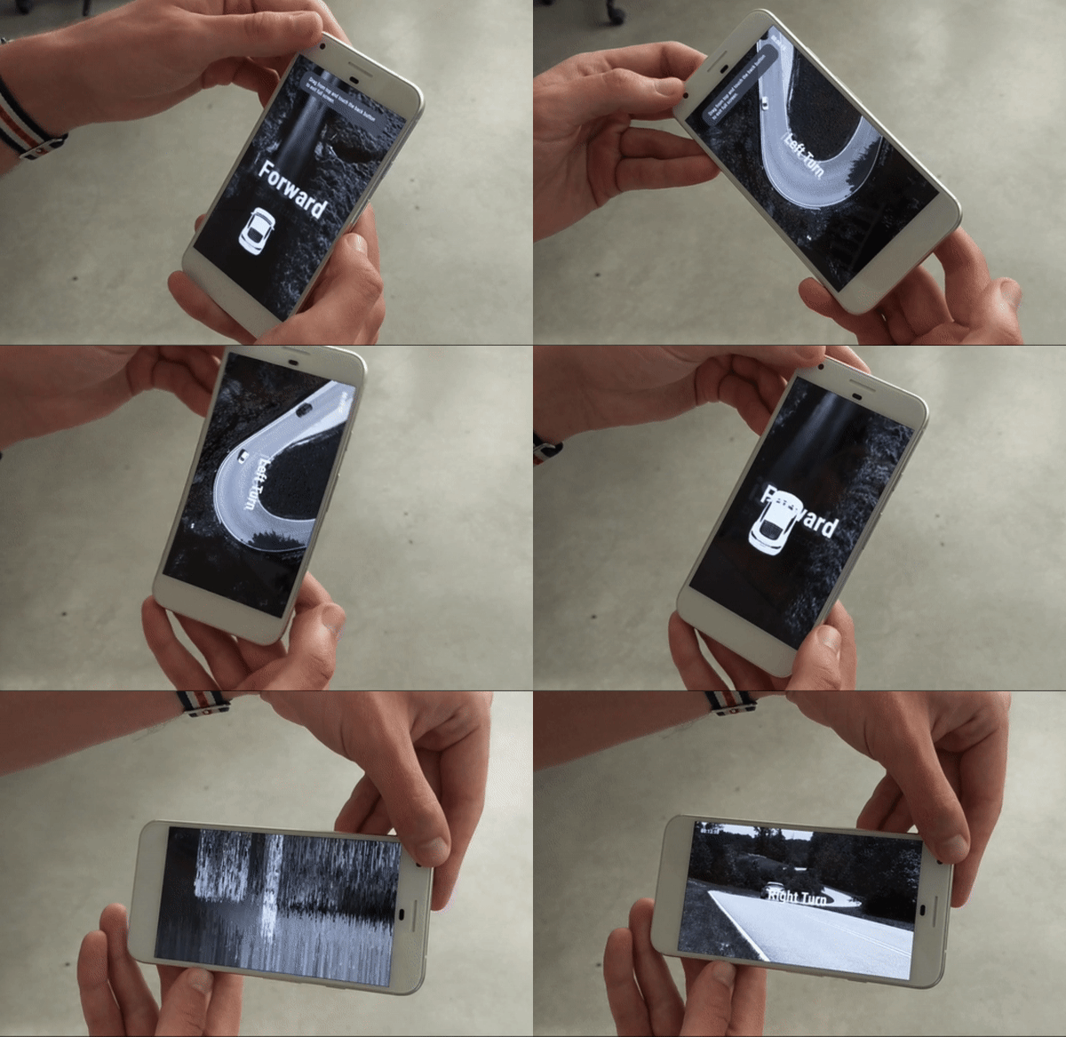
The concept for the experience involved using your phone as a means to control the car. By combining phone movements (measured by the accelerometer and gyroscope) with shader transitions, we were able to create a fairly convincing prototype that would switch between different video cuts when you moved your phone.
Taking TOTAL control
As you can see in the GIF above, the prototype was a pretty basic proof of concept. We were testing shifting between left turns, right turns and straight driving, using only a single video for each movement. Not only did we need to create more movements to allow users to take control of the ILX (including easter egg stunt tricks like tossing your phone), but we also needed to incorporate more video clips and ensure that cutting between videos would resemble a relatively seamless driving route for the vehicle on screen.
The Idea: A Video Grid
In response to the above challenge, we devised a video grid that users would jump around in as they interacted with the experience. This video grid would loop endlessly until the user put their phone down, ending the experience.
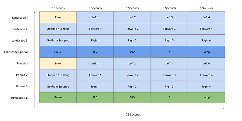
The initial grid (displayed below) comprised of four 25-second landscape videos, and four 25-second portrait videos (one per row), cut together by combining shorter video cuts. This was our planned set-up before the video was captured. As a user goes through the experience, we would combine their gestures and resulting phone orientations in order to position them in a cell on the grid. For example, if a user gestured to do a jump, we’d seek the video to cell 3 in portrait and timecode 20 seconds. This technique worked well as a prototype.
Using Live Footage
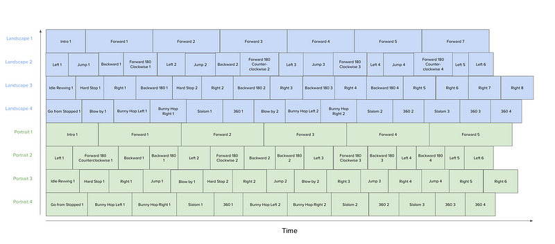
Once the footage came in from the shoot, we had to adjust the video grid to account for the fact that every shot had different time codes. While we maintained the eight cell grid, we found seeking between videos in the grid wasn’t responsive enough — leading to the wrong frames being jumped to as you interacted. And while we could correct this with a 1–2 seconds buffer, some of the clips were just too short to allow for this buffer time.
Compression and Buffering
Our original grid positioned clips of the same movement type adjacently (e.g. all right turn clips next to each other). Given the inconsistency in clip lengths, we were finding cells with lots of short clips followed by a lot of black, and this blew out the video compression. In response to this, we had to move to an ‘any clip can go anywhere’ approach which helped manage the video file size.
A further optimization was arranging the grid to ensure clips were buffered and ready to be served to users. We prioritized certain maneuvers such as Left 1 and Jump 1 in anticipation for early user interactions.
Challenges with Video Seeking
Despite having a video grid set up with the actual footage, we were still facing issues trying to get the grid to behave as intended. The high level finding was that seeking to a specific frame in the middle of a clip was not working as well as hoped.
In response, we implemented frame decoding that would add small dots along the bottom of clip in bits (representing colors) that would tell the graphics card exactly which frame it was looking at. While this gave us the ability to avoid showing incorrect frames, it caused frozen frames which degraded the experience by making it look laggy.
The Final Video Grid
As we were only showing 16 clips, we decided we could put all clips in one texture, making each clip accessible at any time. Also, by playing the clips from zero, we were jumping cells rather than telling the video to seek, which made the experience became much more responsive. The end result was a clean 32 clips, 16 per orientation, as shown below.
Creating the UI
To direct users through the experience, we had to establish a UI that provided guiding instructions without disrupting the experience. This was a key challenge as the experience was naturally a full-screen video, meaning we had experiment with a couple of different methods to avoid obscuring the video.
Our first attempt was using a combination of blend modes, overlays and texture offsetting to create dynamic UI elements that didn’t detract from the visual look and feel. This method allowed text, UI and graphical elements to all co-exist in the same style using the base video as a source. While we liked the look and feel, we found it tended to obscure the video and even change the representation of the car — a big problem when the whole experience was based around showcasing the car itself.
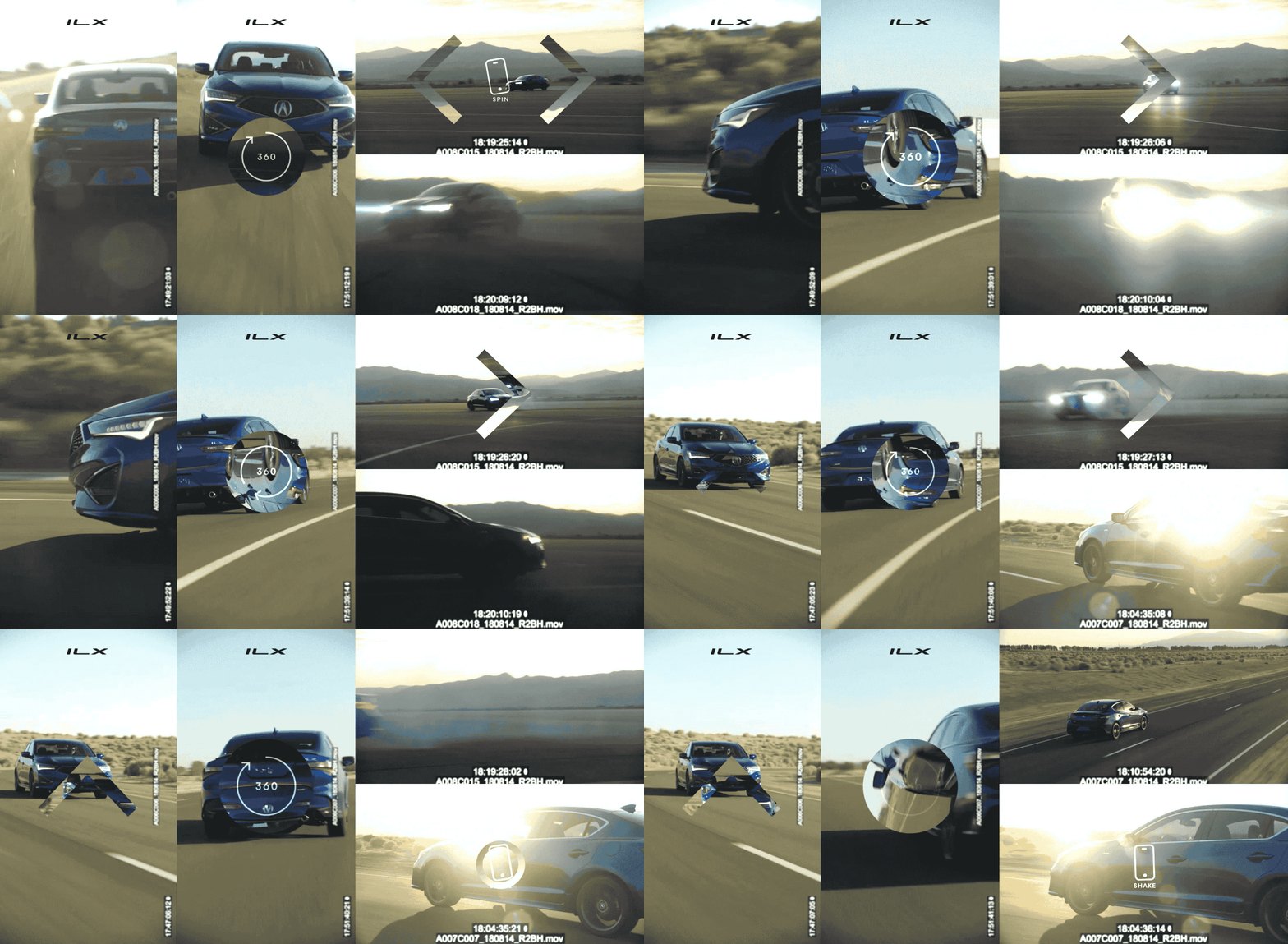
With texture offsetting gone, we were tasked with coming up with a different visual solution that avoided obscuring the video. Our solution was making the overlay texture a bright white, using additive blending to ensure the video would bleed through the UI on top of it. This technique created the semi-transparent UI was applied across the all UI elements in the final experience.
Going Beyond Mobile
To make the experience accessible to as many people as possible, we created a desktop build that simulated the mobile experience.
