Fiomet Case Study
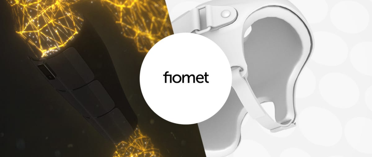
Here at Active Theory, we are often challenged with bringing to life functional product messaging with a creative and engaging experience. While it’s easy to get lost in creative ideas, we believe the true value of these experiences is their ability to not only engage a user, but also deliver key functional points that promote and sell the product.
With Fiomet, we were lucky enough to land on a fantastic synergy between product vision and creative execution. The product, a range of smart health devices that give real-time biometric feedback and guidance, needed a premium digital makeover to establish credibility in going to market.
The Brief: Innovative, Technical Products
To tell the story of Fiomet, we were first onboarded to their mission, values and products. Since we were working closely with their founding partners, the passion behind these products was immense.
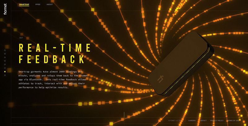
The Smartrap, as they explained, is a compression garment that takes 2,000 readings a minute and communicates these back to a user’s device via Bluetooth. This lets athletes view their body’s response to exercise in real time, enabling them to adjust workout intensity — avoiding injury and maximizing performance.
PPOD, while part of the same Fiomet brand, is a separate product for a different market. It is a cranial device worn by infants designed to assist the formation of their head shape from a young age.
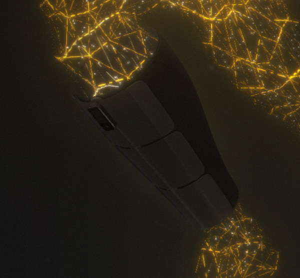
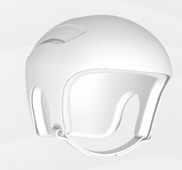
The Smartrap compression device (left) and PPD (right).
Our Approach: Premium Design, Streamlined Messaging
Given the background above, we were tasked with introducing these two completely different products, as well as some corporate information, in a single web experience.
Our first step was to establish a content strategy and messaging hierarchy. The key objective here was maintaining the technical authority of the product, while simultaneously simplifying the messaging in order to make it appropriately digestible as web content.
With these guardrails in mind, the approach was clear: we would use premium visual direction and motion characteristics to convey technical authority, and streamlined copy to convey key product USPs.
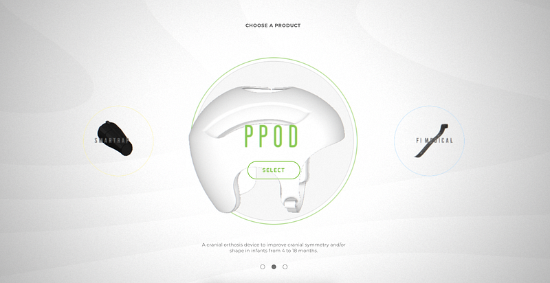
Showcasing the Products
Our biggest challenge was presenting the products in a way that allowed the user to explore different angles and features. To do this, we used 3D scenes featuring a very strong visual element. This main element would also be paired with a bespoke background to further highlight the feature.
For the overall art direction, we went for a clean and futuristic look with a limited color palette, thin lines, and well-balanced layout. For each product specifically, the performance-focused Smartrap was darker, moodier, and used fluid patterns to represent the human form, while the infant developmental PPOD had a softer, toned down look to make the product more approachable and playful.
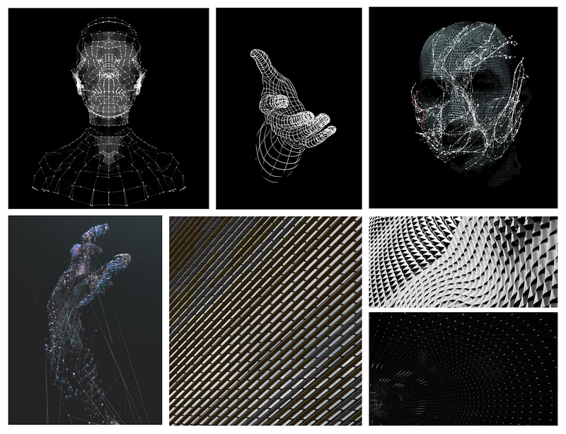
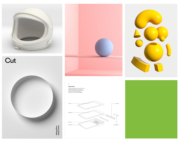
The products serve different functions for different audiences. Our creative direction would reflect this.
Optimizing Models For The Web
As with many products, the initial files supplied to us from Fiomet were high-poly CAD models. In order to make these usable in a web environment, we used two different approaches. For PPOD, we reduced the poly count by retopologizing the CAD model. For the Smartrap, the high-poly model was so sophisticated that it turned out to be easier to remodel the device from scratch, using the CAD file as a reference These techniques reduced the poly count from 300k+ to 15–20k, making them suitable for the web.
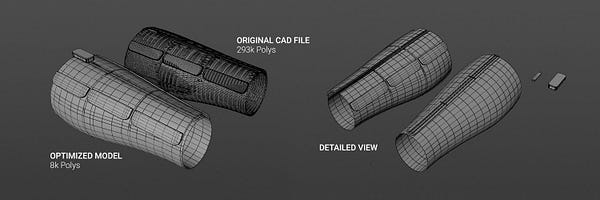
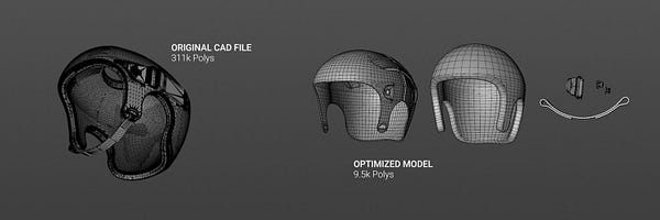
The Smartrap (left) was modeled from scratched. The P-POD (right) was retopologized from the CAD model.
Texturing: Bringing Products to Life
Once optimized, we unwrapped the 2 models and textured them using different approaches. We initially used Substance Painter and PBR textures for both, allowing us to fully customize the materials and lighting.
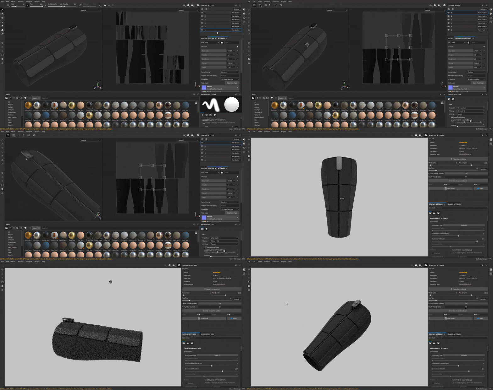
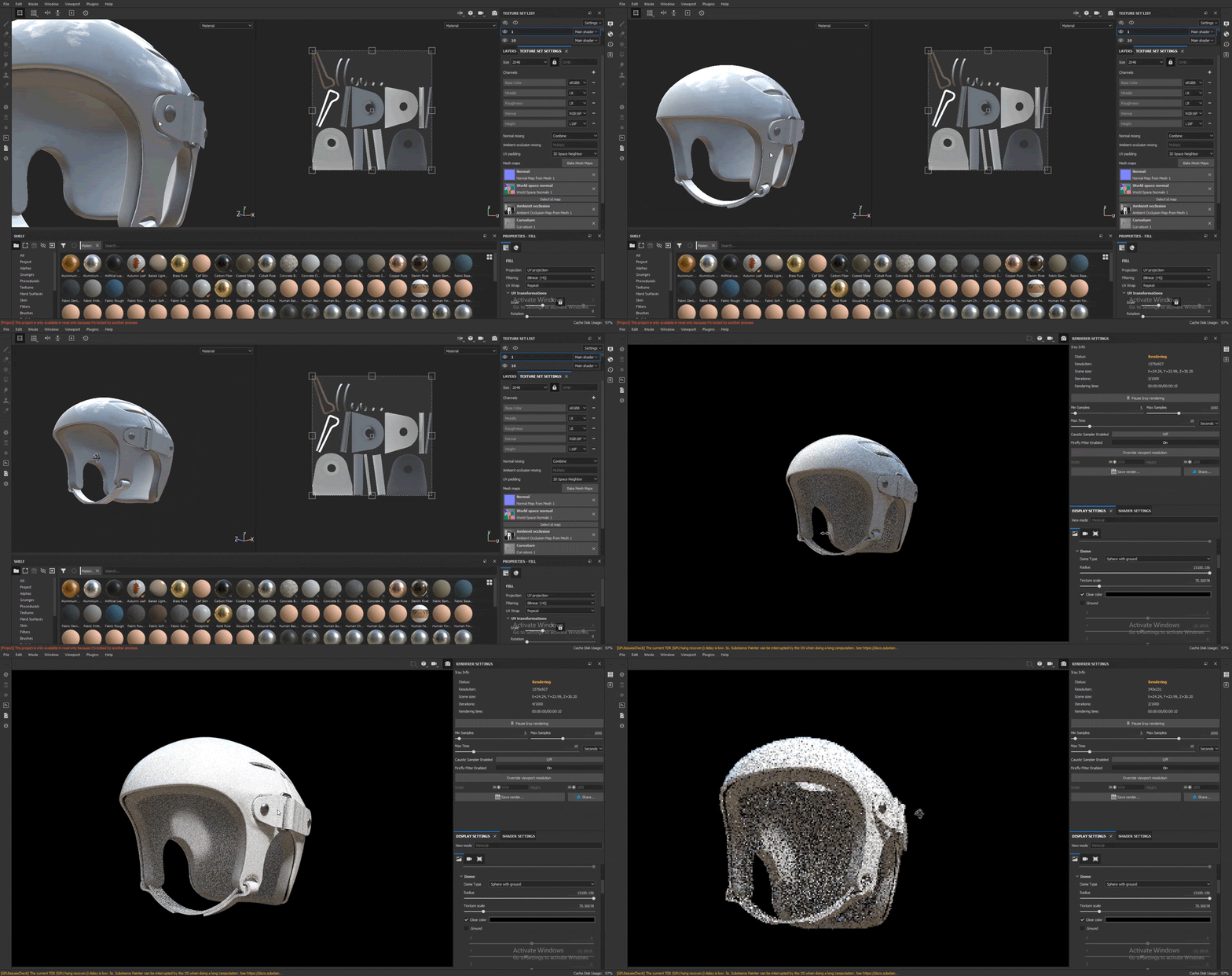
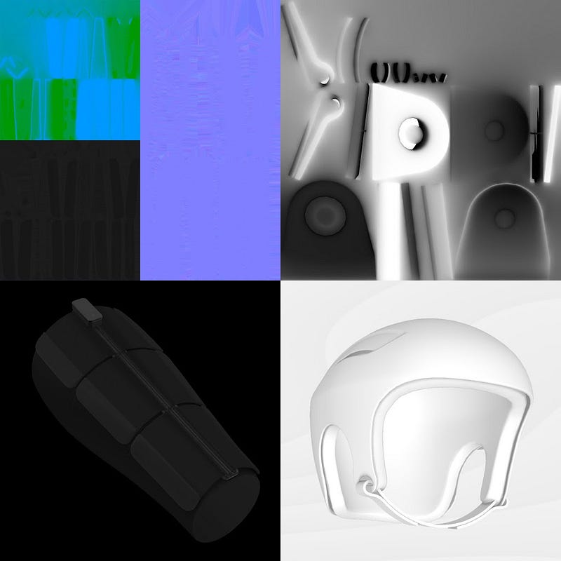
During this process we made a light pivot. Given that the PPOD didn’t have too many different parts and materials, we shifted our approach, using a simple ambient occlusion texture and lambert lighting. This gave sufficient visual effects and was more performant.
Empowering User Navigation
Given we had a set of discrete product-marketing points to convey, we decided to divide the site into a series of fullscreen 3D sections. Conventionally, a drawback of this approach is users are limited to a basic scroll input which triggers a transition between scenes. We wanted to give users control way beyond this.
For inputs, users can browse by scrolling, keyboard navigation, bullets, native scrollbar and dragging. They can also interrupt these transitions by scrolling or dragging half way.
Transitions
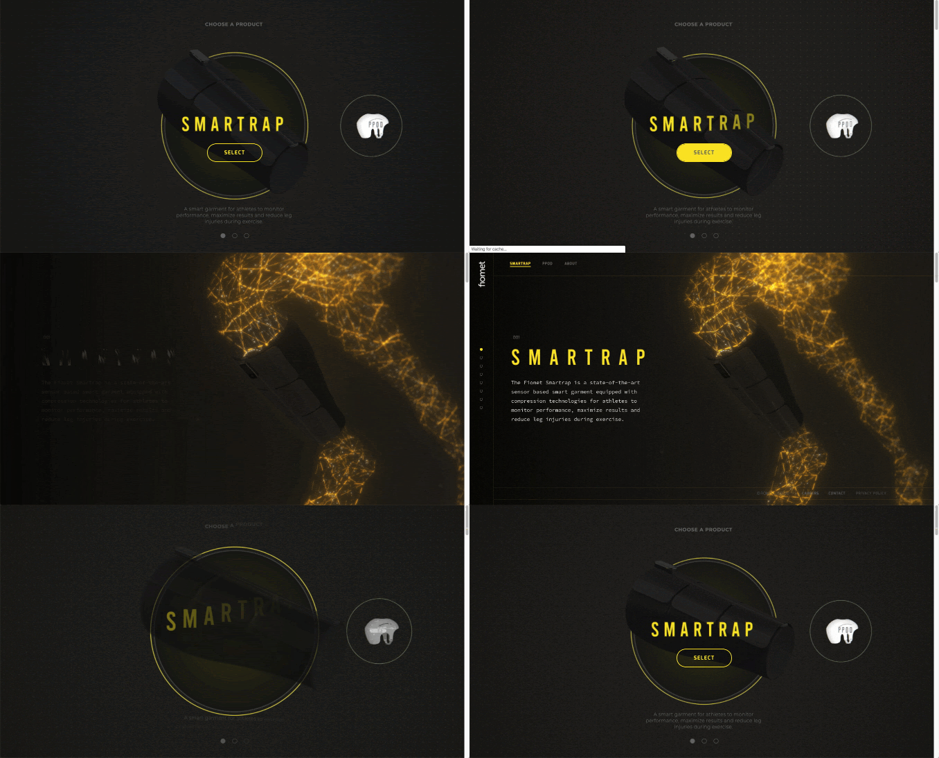
To give off that shiny, premium, site feel, we invested in polished transitions between pages and sections. This kicks off at the site landing, with a portal-like animation immersing the user into the style and colors of each product.
Since we had a two sided, dark-light art direction, we needed a logical and artful way of moving between the two sections. For this, we implemented a lateral transition that matched the two designs and avoided a hard cut between the black and white backgrounds.
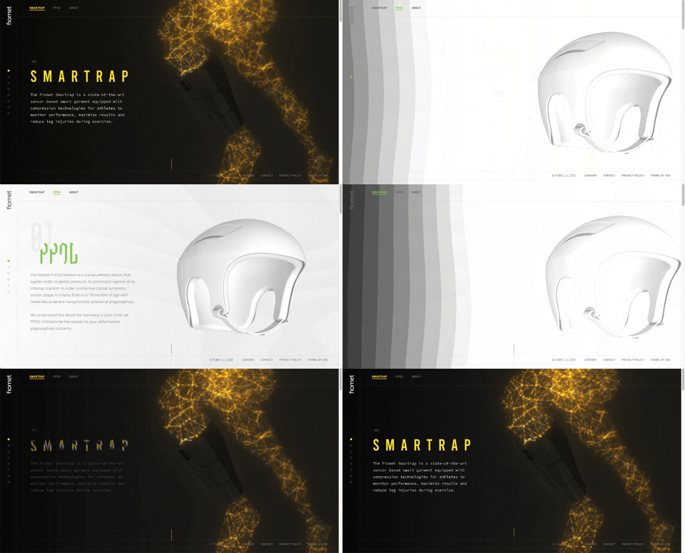
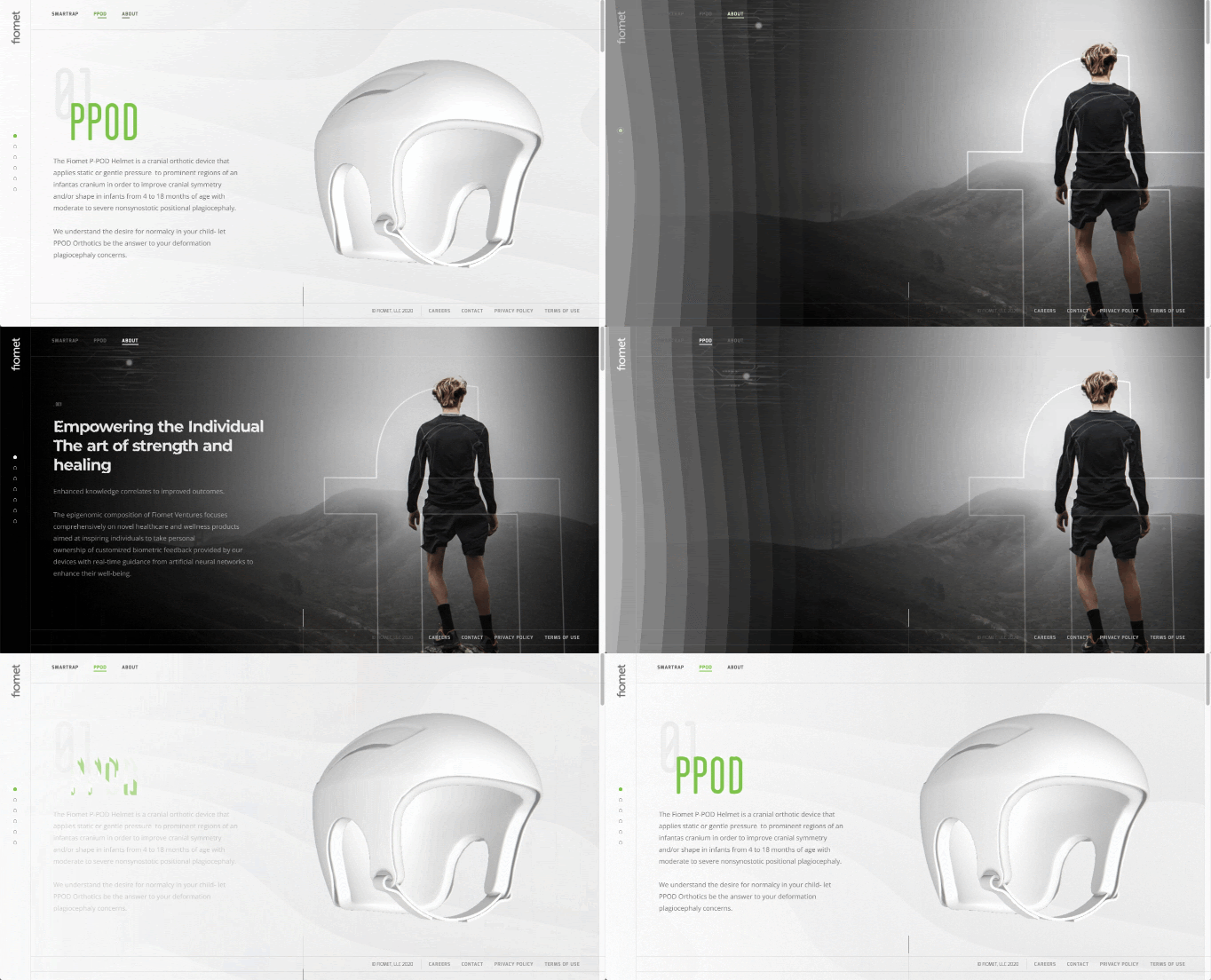
A lateral transition that matched the two designs transitions users between sections
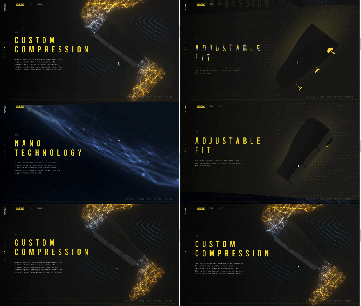
Within product sections, we wanted to create a bit of natural tactileness for transitions between feature sections. This was done by making elements like the border and camera responsive to scroll speed and the position of the user.
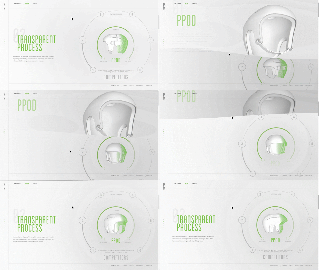
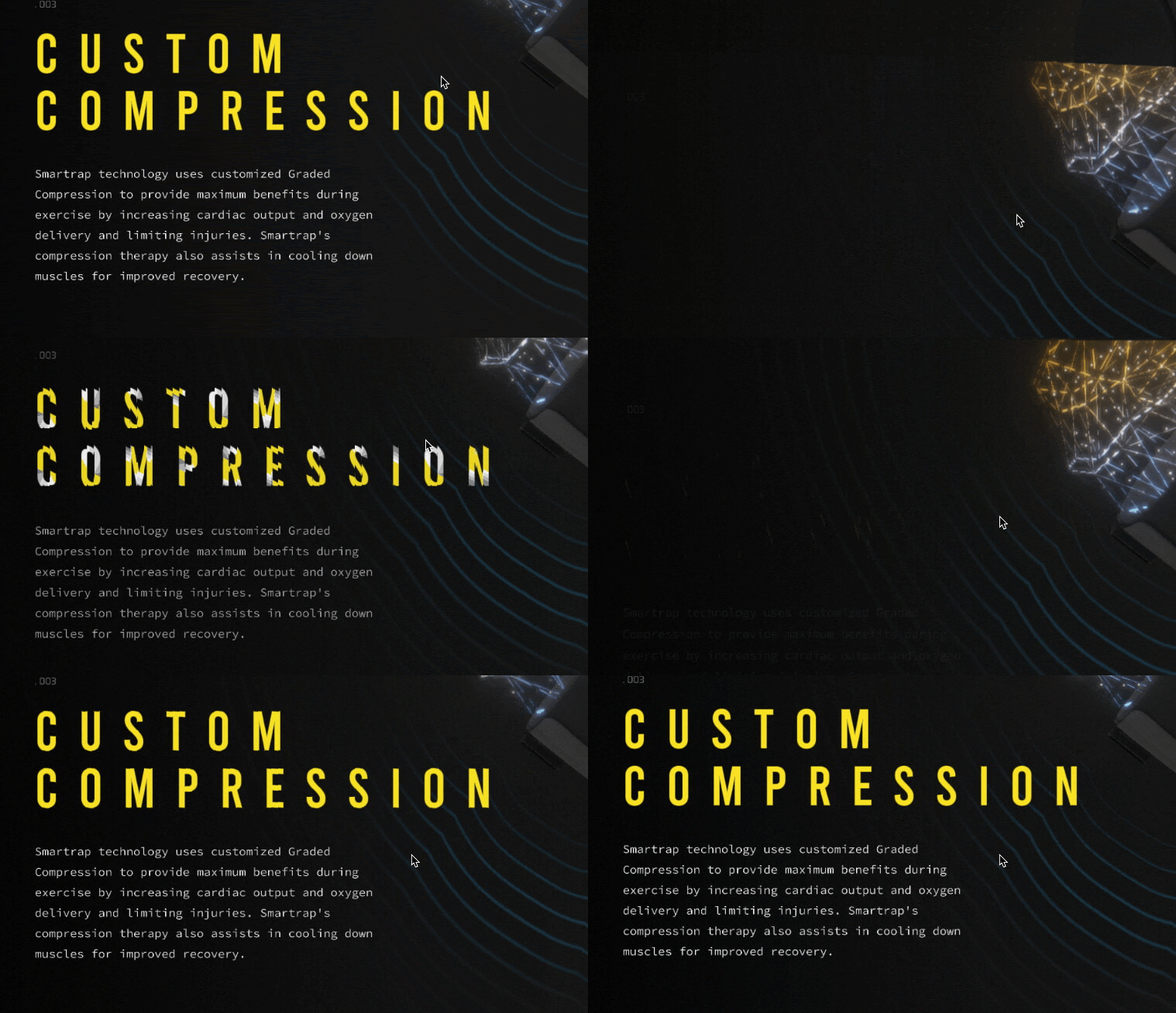
To further embolden the effect of the 3D scene, we also animated the titles based on user interaction. For this, we built titles in WebGL using 2 sets of textures per font: a MSDF texture to draw the shape of the letters and another one with a gradient map to determine letter animation.
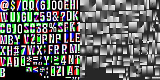
These textures combined with some shader programming made the final title animations:
Depth of Field Effect
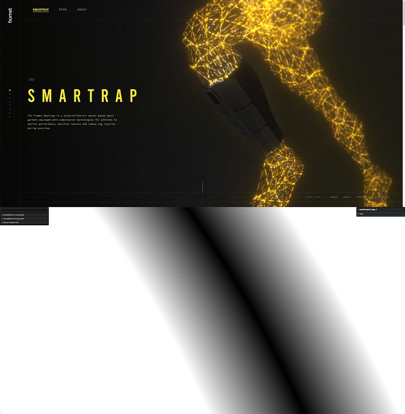
For some scenes, we added a subtle depth of field (DOF) effect to make them even more immersive. As genuine real-time DOF is an expensive technique that requires quite a bit of computing power, we instead implemented it using a low sample poisson disk blur, a blue noise texture and some masking logic that selected areas to apply it. This gave the DOF effect without expensive calculations or any usage of the depth buffer.
Managing Performance and Rendering
With every section of the site being a different 3D scene, we had to implement a few measures to manage performance:
- Visibility control. No matter what section of the site users are looking at, we only render visible screens. Thankfully, by dedicating time up front to make the site easily browsable, we were able to keep track of what a user is viewing, making this process easier.
- Memory usage. With every 3D scene using many render targets, we needed a smart solution to ensure memory usage stayed within an acceptable range. To do this, we reused these targets throughout the site. The implementation involved using an internal tool we built on another project.
- Hardware detection. By detecting the device a user is on, we would modify effects and transitions to ensure they get the best experience possible based on their device capabilities.
Conclusion
Having worked closely with Fiomet over the past few months, we are very happy with the platform we’ve built together. With this online platform in place, and product development gaining momentum, stay tuned for more from Fiomet soon.
The Fiomet web platform is available at fiomet.com.
