Welcome to Hogwarts
Technical Case-study
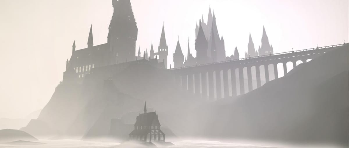
Creating an interactive Hogwarts was a dream project. What could be better than letting millions of Harry Potter fans immerse themselves into this fantastical world, discovering information and exploring the layout of Hogwarts and its surrounding areas? This was a uniquely innovative project in achieving this — in a method that was accessible in a mere matter of seconds from your home computer or even the phone in your pocket.
Wait, I can load the entire Hogwarts Castle on my phone?
One of the major challenges was how we were going to load the entire Hogwarts castle in a way that didn’t feel like you were downloading an entire video game.
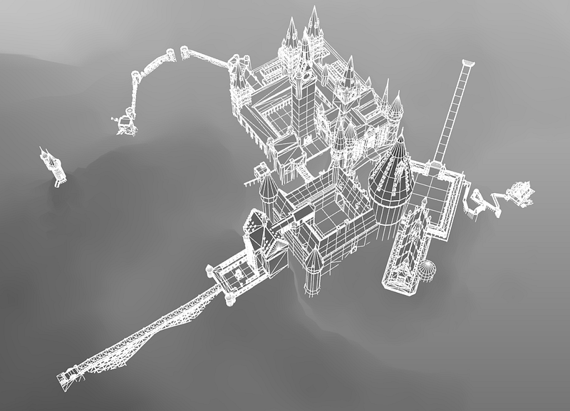
We were supplied with some assets that made up the majority of the geometry we needed, but they weren’t created for real-time rendering. So through a large effort of re-modeling and optimization, we brought the total triangles down from 6,000,000 to 210,000 without losing noticeable visual quality.
This amount of data as an OBJ file still weighed in at 37.4mb and GLTF weighed 24.1mb. We felt this was still too much to expect a user on a mobile device to download, even if the user was downloading the entire Hogwarts castle.
Instead we wrote a custom exporter for Maya using the Python API, and exported only position data with float precision clamped to 4 decimal places, ignoring UV and Normal data. This data when gzipped weighed only 2.1mb.
Why a stylised aesthetic?
It’s interesting to note that the final build matched our early concept fairly accurately. This is uncommon for us as our builds usually evolve as we spend more time exploring and prototyping on ideas.
We knew from the beginning that we didn’t want to even attempt a realistic rendering. Doing so would mean expecting subconscious (or conscious) comparisons to the rendering people see in the latest AAA game titles. Also knowing that with technology constantly improving, trying to achieve realism is something that ages very quickly.
Going with a stylized approach allowed us to work without the large textures needed in a more realistic design. This enabled us to hit our goal of allowing people to load the entire Hogwarts Castle in under 5 seconds on a decent mobile connection.
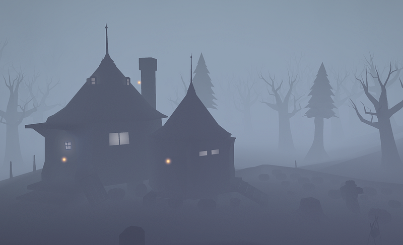
Right away, we started exploring simpler techniques that would render efficiently and settled upon a fog-heavy treatment that highlights the silhouettes of objects instead of the textures, allowing the users’ own imagination to fill in the blanks. Because of this, we were able to remove some of the geometry data used to render textures and lighting in real-time.
In an early exploration in Maya, we liked the amount of detail and soft gradients this style delivered naturally, while remaining subtle.
Download once, render many times
Another technique we implemented to reduce the load time was to “instance” certain assets that could be duplicated and placed throughout the scene many times. Such elements included the trees, windows, lanterns and flags.
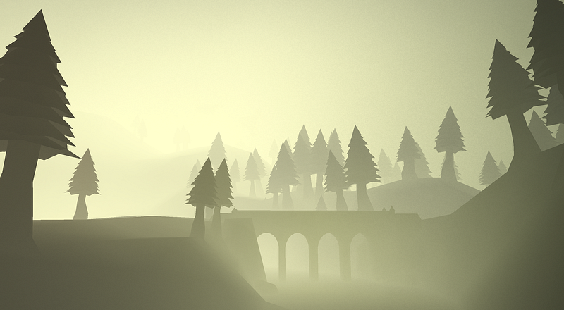
In order to do so, we only had to export the data for one single object (a single tree for instance), and then another json file listing the placement and rotation for each of the copies. For example, the gzipped file for the lantern weighed 1kb, and its placement file weighed 500bytes. This same data, exported as an OBJ file, weighed a little over 1mb.
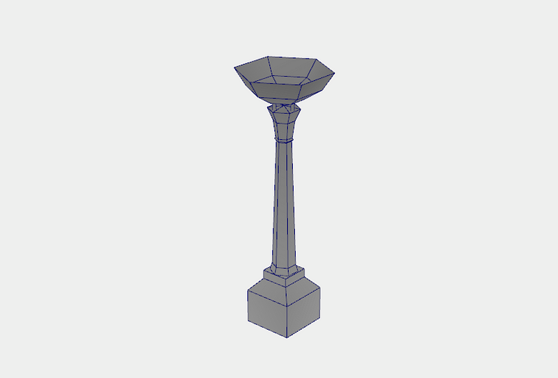
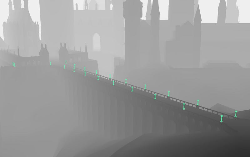
In this lantern example, we only used around 50 instances, however much greater savings were found for the trees in the Forbidden Forest scene, in which thousands of instances were used.
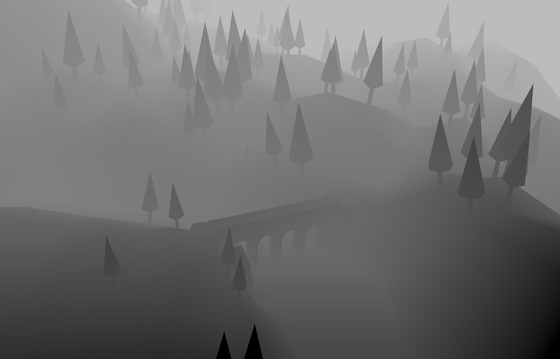
In order to place the trees simply, we used Maya’s Mash nodes, which allowed us to paint on the terrain where we wanted the trees to be placed.
As you can see in the video above and image below, a lower-poly placeholder tree is used during the placement, which allows the program to run more efficiently. And since the only data we needed from these instances was their position, scale and rotation, the actual geometry didn’t matter at all.
Another use of instance geometry were the windows in Hogwarts Castle. These were placed with much more care and precision than the trees.
A trick we applied in the shader for the windows was to increase the geometry size and render a glow on the mesh itself, which in turn, saved us the need for an expensive bloom pass. To hide the illusion, as the windows are seen from a harsh angle, we have them fade out instead of being visible from the side as a flat 2D plane.
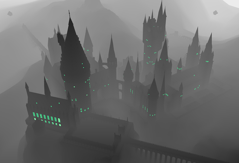
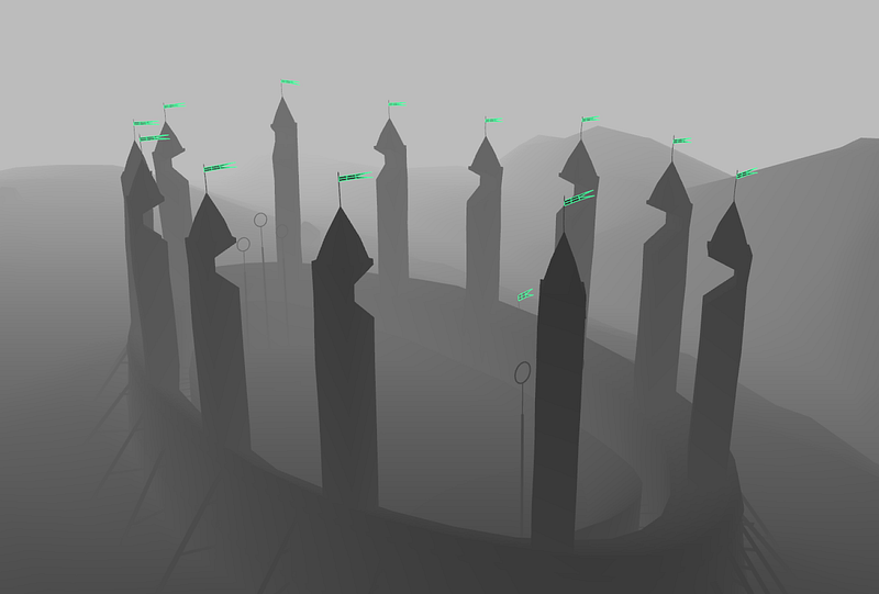
This is another benefit of sharing geometry — that the material (shaders) are also shared between instances. This allowed us to do some extra techniques (such as the window outer glow) that were used sparingly and applied only to some of the instanced meshes. For example, below you can see the flags fluttering in the wind.
This was achieved by animating within the vertex shader on the instances. Some randomness was applied using the instances’ locations so that they didn’t all move at the exact same time, giving them a more organic feeling.
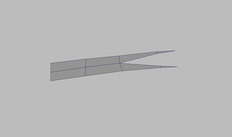
Below is the single flag geometry used for the instances.
And here you can see the placement of each of these instances.
I feel like I’m flying!
The way user’s moved around the castle was a huge consideration. We wanted it to feel as intuitive as possible while supporting desktop and mobile devices. Implementing a ‘free-movement’ interaction, which is common in video-games where the user can move in any direction, would have been counter-intuitive — actually making it frustrating for the user to get to the main points of interest as it would take longer and be harder to master.
We instead made looping curves for each of the scenes that a user would follow. We made sure that these curves visited each of the important areas from a visually pleasing perspective, while still giving the user the possibility to look around, searching for hidden information.
One trick that we implemented was to initially block the user from scrolling backwards, preventing them from accidentally flying the wrong way in the beginning and feeling disoriented. Instead, they first need to move forward, immediately getting a feel for the interaction, and then they have the possibility of backtracking if they wish. A related approach is used in some video games, where they request the user to look up, and depending on the next user input, they set the camera control to either be inverted or regular.
An interaction that we tossed back and forth was the decision to tie the camera movement to the mouse with or without needing to click and drag. This is normally solved in video games by capturing the cursor completely, and keeping the aiming reticle locked to the center of the screen. But we didn’t want to capture the mouse, as this would force the user to accept a notification popup, and then have to exit it to use the UI elements.
We liked the ease at which looking around by moving the mouse without dragging gave, however it made it more difficult to accurately click on an information hotspot, as the camera was constantly moving. The alternative option, to drag in order to move the camera, was very easy to understand, but becomes quite tiresome after awhile- especially on a touchpad. In the end, the final decision was to implement both — the prior being limited somewhat so that it didn’t do a full 180. This let the user look around to a degree with ease, and if they wanted to turn around completely, they could click and drag.
Illustrations
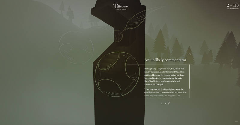
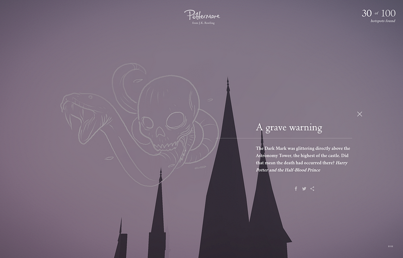
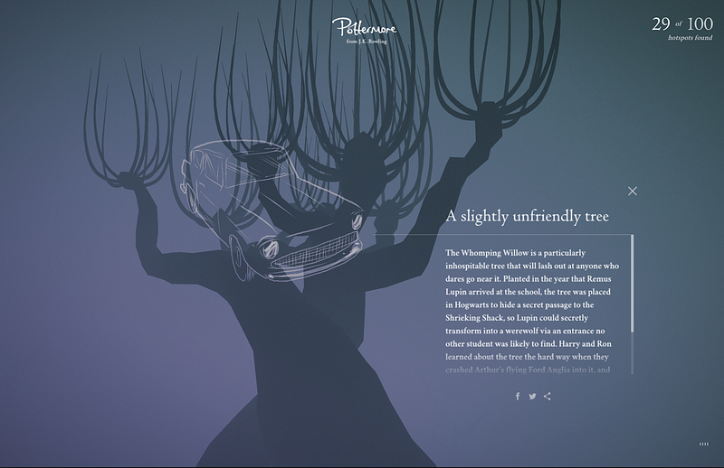
Accompanying some of the hotspots were illustrations specific to the copy contained within it. We wanted to create something more interesting, and with a smaller file size, than an image, so we developed a tool that allowed our artist to draw directly on the scene in context of the hotspot and place lines in 3D space to create a unique perspective.
One time use?
We wanted this experience to be a place where fans could explore many times, so it was high on our priority list to give them a reason to do so.
We put in place a number of in-house tools that the Pottermore client could use to inject new content at given intervals. For example, this first release was made on September 1st, to coincide with ‘Back to School’ in the UK. It consisted of 100 content hotspots and 20 illustrations
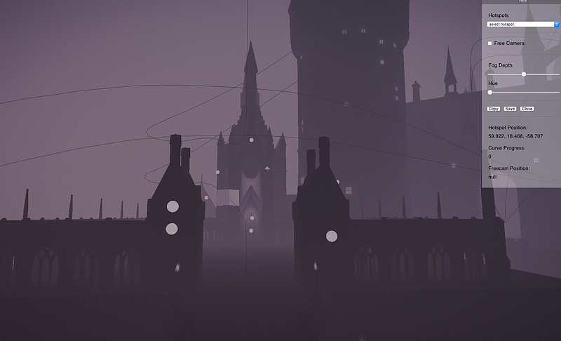
The tools included a hotspot placement tool, which was a version of the website in which the client could progress around the scene and click on geometry to snap a hotspot to that location. Then they could manually move the point to adjust it and also move the camera to a desired location. Once that was set, they could store the stringified data and feed it back to us through a CMS.
The second tool was an illustration platform. Again, another version of the website was made — designated this time for the iPad Pro to benefit from the touch sensitivity of the Apple Pencil. In this version, the client’s illustrator would choose from the list of hotspots created using the prior tool, and then draw directly on the website in context.
We chose this approach over SVG or bitmap for several reasons. Using our data format created a much smaller file size than either SVG or bitmap because all we needed to record were line segments along the center of the curve, and a relative width at each point.
This data then matched our line-rendering engine, which was also used for the tool itself — so the input that the illustrator drew would be exactly what the end-user would see. The final, major benefit is that the data in this format allowed us to easily animate the lines drawing in a vertex shader, and also oscillate them with some sinusoidal movement — creating drawings that felt really alive.

The resulting effect of these sequential releases of content and illustrations is that every time a new content release is made, users will have a reason to re-explore the same areas again, finding new content and becoming more familiar with each scene.
Conclusion
Working on this project, similar to Discover Your Patronus last year, was a special opportunity for us to create a tangible version of a universe that millions of people, including many of our own team members, have a deep emotional connection to.
