
Spotify: Bon Iver Viisualiizer
We built the Bon Iver Visualiizer to support the launch of his new album i,i. The brief was to create a real time, living breathing…
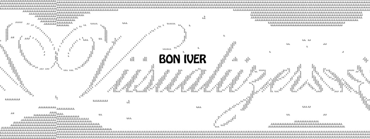
We built the Bon Iver Visualiizer to support the launch of his new album i,i. The brief was to create a real time, living breathing visualizer, made only of i’s to show how the world is listening to the album.
By working with Spotify to source streaming data, we were able to map listeners from all over the world, highlighting the global listening patterns of Bon Iver’s growing collective of fans, rearranging themselves to show a tremendous amount of data and artwork.
The album name “i,i” reflects not only Bon Iver himself but also the collaborators who contributed to the album: from engineers to designers to writers, everyone poured a bit of their soul into. Beyond this, the i’s also represent members of Bon Iver’s global fanbase: every listener is now a part of the Bon Iver collective.
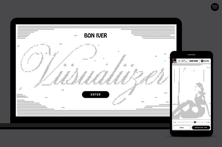
The ViiSUALiiZER is one of the core components in the album release and acts as a visual hub for listeners tuning in on Spotify.
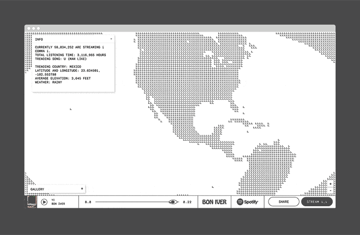
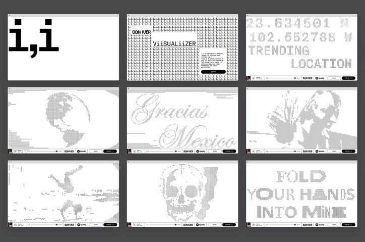
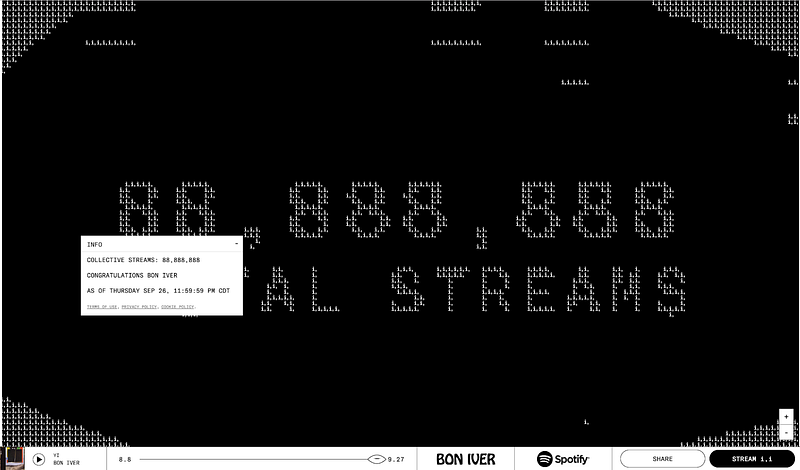
Using Spotify data as current streams, collective streams, total listening time and trending songs, it tracks in real time the amount of hours streamed, trending countries and songs, and links the album artwork to data.
“Every listener is now a part of the Bon Iver collective”
Front End
Users can zoom out and zoom in on the globe to see data: as they move their mouse across the site, the typography moves and swells, triggering new lyrics and graphics.
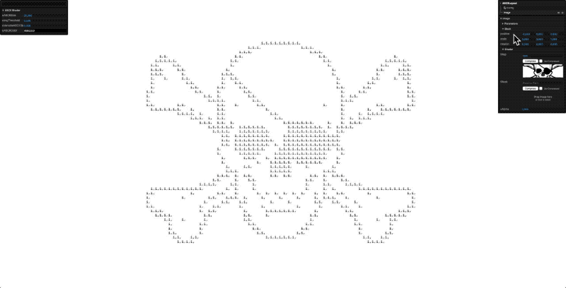
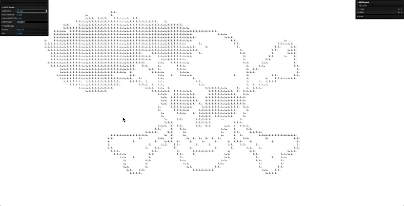
The illustrations were made by the Eric Timothy Carlson and then translated into old-school ASCII art. The videos that play throughout the site were made by Aaron Anderson, also a frequent collaborator of Bon Iver.
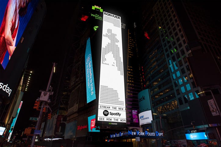
The Visualiser can be used online via desktop and mobile and graphics from the campaign have also graced digital billboards in NYC’s Times Square.
As we developed the site, we enhanced it with a few small details for the most engaged users. For example, when on the main screen exploring streaming info, the user can delete the words in the textbox, similar to a notepad tool. We also added a gallery so users can view the original art. And, we added a special visual when i,i hit 88 million streams.
ASCII Shader
Underneath the site is a GLSL shader that converts any image, video or text to “i,i”. The shader first converts the image to either a black or white pixel based on a threshold value, if the pixel is black then a “i” would appear, if it was white it would be blank. This approach allowed any graphic, including the liquid simulation to be converted to “i,i” ASCII art.
We built a client-facing tool that allowed drag-and-drop functionality to test how it would appear on the site.
The front-end then takes the uploaded content and runs it through a shader to display on the site with the configured settings.
Back End
Since we didn’t know what the data would be ahead of time, we needed to make a flexible system that could tell the story of the data.
We created a custom CMS that allowed Spotify to craft a story based on the data of the day. The creatives could upload copy, images, and video that was transformed into ASCII art. They could also add lat/long values that determined where the globe would zoom in/out.