Spotify Wrapped
A look under the hood at the technology and techniques used to power Spotify Wrapped 2018.
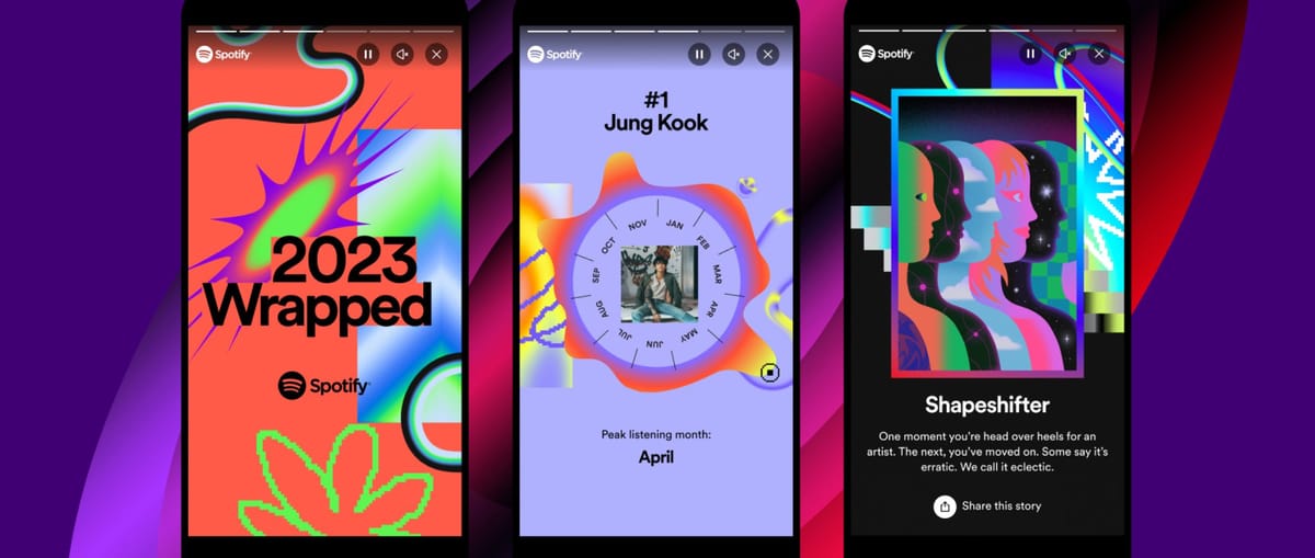
A look under the hood at the technology and techniques used to power Spotify Wrapped.
The Brief
Our second Spotify Wrapped campaign centered around two things — color and typography. Color was used for personalization, with the colors in each user’s experience being dictated by their own listening data. Typography was used for cinematic effect, with animations leading into data stories giving the overall experience a movie title sequence feel.
Building Blocks: Text Geometry
The largest technical challenge was something seemingly simple — text. With so much of the visual design being anchored with text, we needed to be able to animate text in a way that is not possible with traditional HTML or Canvas. In order to render text in WebGL, we had to use and build upon the MSDF approach.
Text in WebGL has one huge benefit over HTML or Canvas — measurements of text size are extremely accurate. Because of this, it was relatively straightforward to build layouts where elements relied on the position of each other in order match the design.
The difference in our implementation began with moving the text geometry generation off the main thread and into a pool of WebWorker threads. By making it asynchronous, we were able to generate text in parallel without blocking animation on the main UI thread.
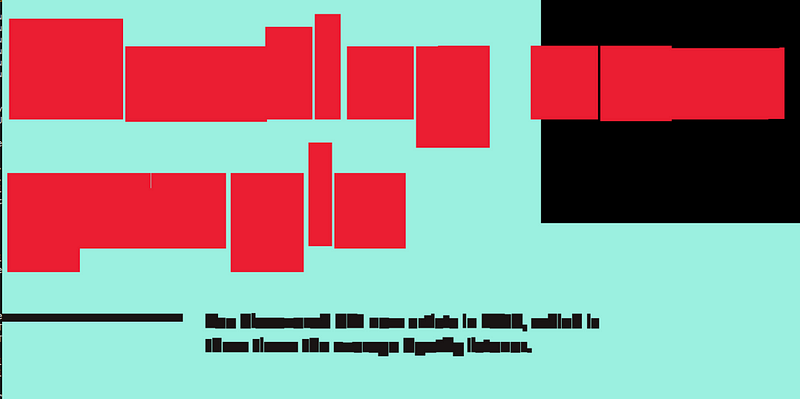
When we generated the text geometry, we had to assign data to each letter for where it lay within it’s word, line, and entire text block. This allowed us to animate the geometry in a shader, creating more interesting animations when revealing text on the screen.
Page Layouts: Our UI Toolkit
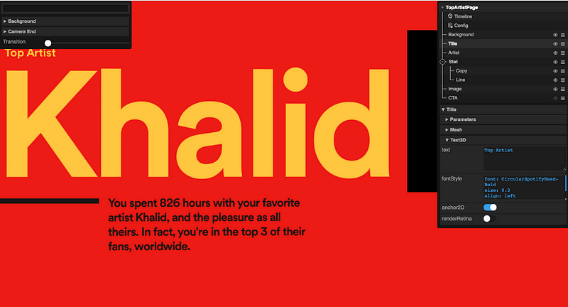
Text laid out on each page was created using our UI toolkit. This toolkit allows us to build out each page visually. At runtime, the text is populated with the dynamic copy from Spotify’s API to create an experience personalized for the user.
The Transitions
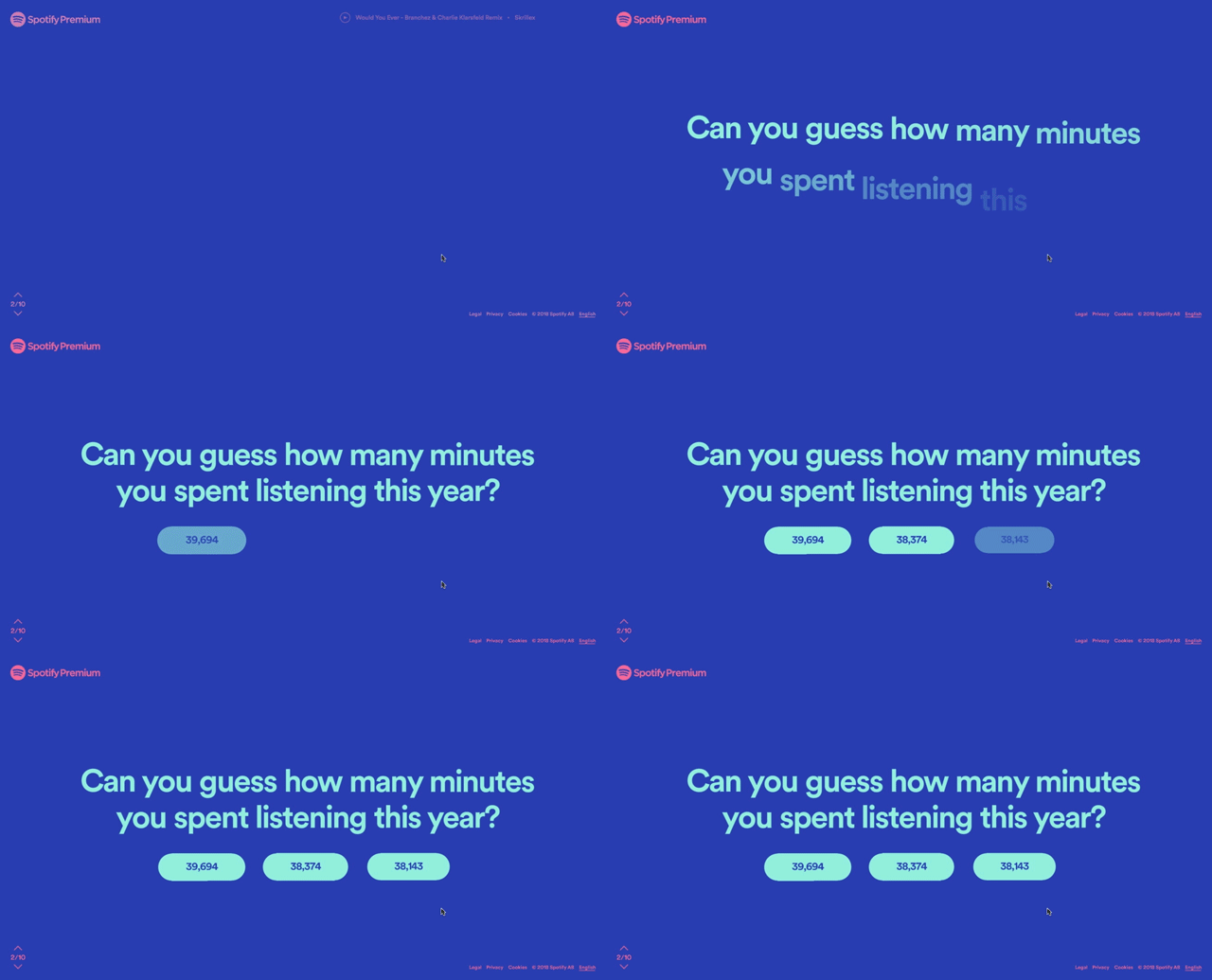
With the pages built and text solution in place, we needed to create seamless transitions that resolved to each layout. The layout and animations were kept separate, and rendered in their own scenes to their own render targets. To align the layout and animations, we cloned a copy of the text mesh from the layout (which was already placed correctly based on the user’s screen). This clone was then brought it into the transition scene, allowing us to line it up perfectly with the layout.
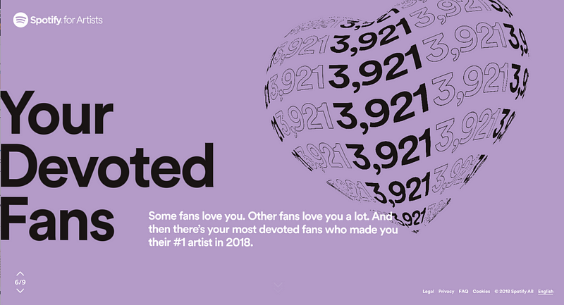
Some of the transitions involved text placed on a 3D model that needed to be animated and dynamic. For these cases, we exported geometry from Maya with the correct UV’s and an example texture. In code, we create a render target that matched the required aspect ratio and fit dynamic text within its bounds. The render target was then used in the shader of the model and animated to fit the form.
Transitions in the experience.
An Interactive Visual Language
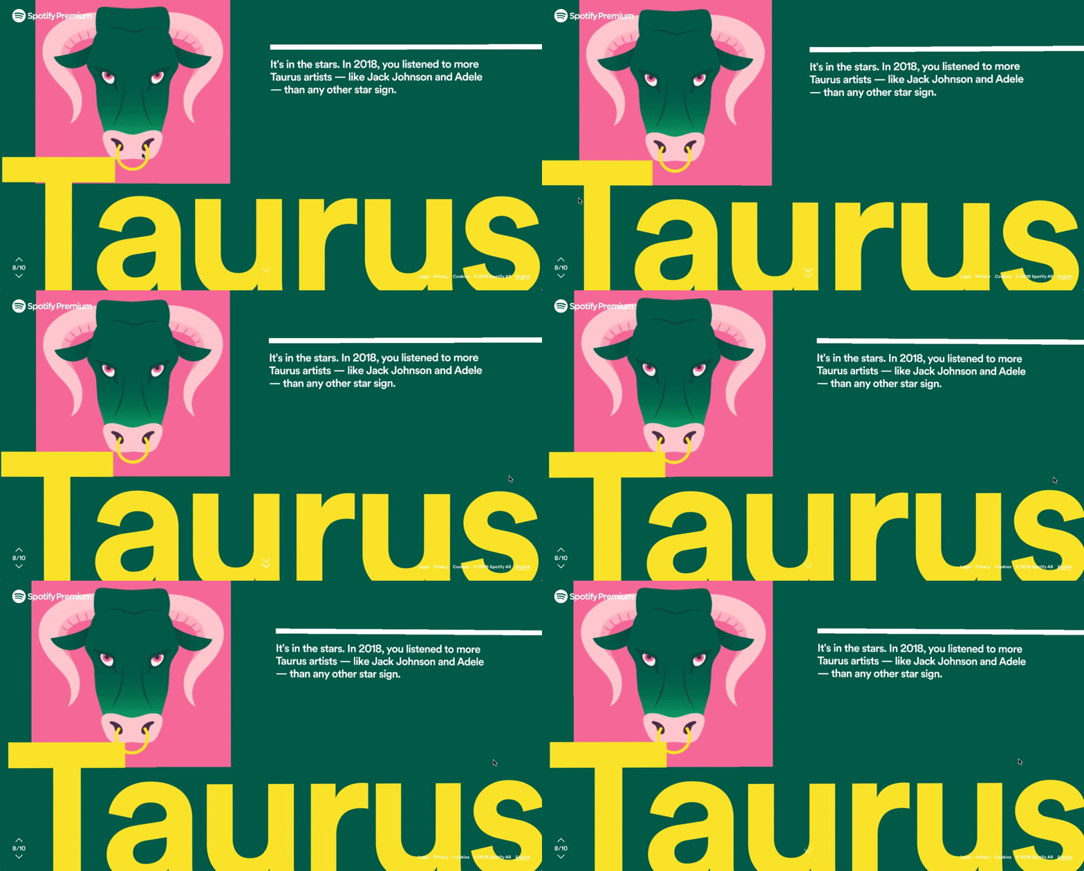
The visual language of Wrapped was large text that fit perfectly to screen dimensions. Early on, we worked with Spotify’s design team to maintain this aesthetic, while adding dimensionality to give flexibility for interactive transitions.
Our solution was to create the layers of each section on different planes in Z-space. To anchor the text to match the design and always appear to fill the screen, we created a frustum that filled the screen at the layer’s Z-position and then calculated an amount to scale the text, fitting it to the desired size and creating parallax between layers when animating.
Localization
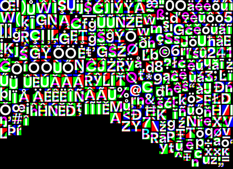
A large part of the Wrapped campaign was localizing to 21 languages. We were initially concerned about how that would work with WebGL text, but the solution was relatively straightforward. All copy was stored in a CMS and every time a publish workflow occurred, we generated the MSDF assets for each language using glyphs from the CMS.
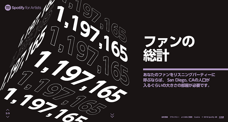
Certain languages have different rules about how lines can break. While English breaks on a space, Chinese, Thai, and Japanese grammar dictates a line break can happen only after certain characters. Thankfully, WebGL text again provided an easy solution, as we were able to pass an array of allowable characters to the WebWorker generating the text and only break the lines when an allowable character was found.
The Colors of Wrapped
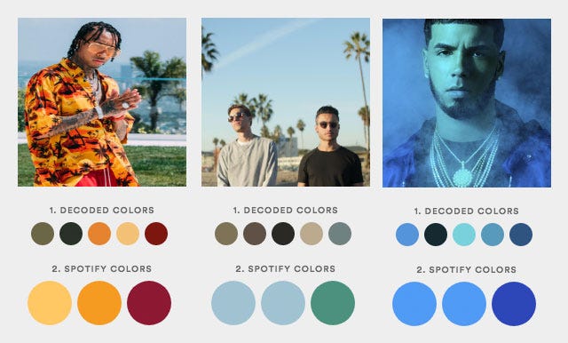
Last, but certainly not least, are the colors that were used throughout the experience. From project kickoff, Spotify’s request was to have an experience unique to each user, which the colors of stories and share cards dictated by the images associated with the user’s listening data.
After a number of iterations, our color solution worked by passing pixel data from an image to a WebWorker thread and extracting recurring color values. The CMS held two lists. First, a list of colors that exist within the Spotify palette and second, a list of 3-color schemes comprised of colors from the first list. Once we extracted colors from the image, we sorted them by vibrancy and used the CIEDE2000 algorithm to match the top extracted colors to a corresponding Spotify color from the first list.
Once it was narrowed down to three Spotify colors, we compared those against all of the schemes on the second list. If we found a scheme that contains all three colors, it was selected. If, for example, only 2 of the 3 colors matched, we would pick a winner from all schemes with 2 matches by using the CIEDE2000 algorithm to compare outlying colors and determine which scheme was the closest match overall.
So that’s a wrap on Spotify Wrapped 2018. We’d like to thank the Spotify team for being fantastic to work with and hope everyone enjoyed learning about their 2018 listening habits.
Spotify Wrapped 2018 is available at http://spotifywrapped.com.
