
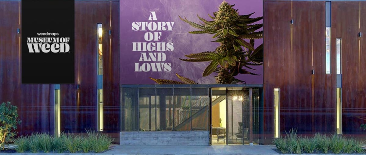
Museum of Weed
A Story of Political and Social Change
A Story of Political and Social Change
The Museum of Weed is a temporary exhibition hosted by Weedmaps and supported by VICE. Live in Los Angeles during August and September 2019, the 30,000 sqft experience features seven immersive exhibits that take visitors through the evolving history of cannabis in the United States.
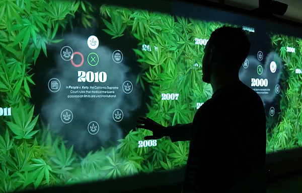
In May this year, VICE approached us with the opportunity to work on Exhibit #7 — Legalization. This exhibit would consist of two core elements, an interactive timeline and a data visualization map, which would fill a room educating visitors on how political attitudes towards cannabis have changed over time.
Part One: The Interactive Timeline
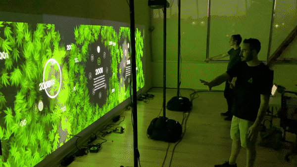
In order to demonstrate how cultural perceptions towards cannabis have shifted over time, we were tasked with creating an interactive timeline that museum attendees could explore.
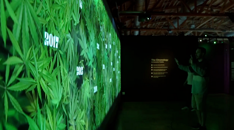
User Interactions
In order to make interaction seamless, we proposed using a Kinect to gather input data from exhibit users. This would be visualized as a wall of rustling leaves, with smoke floating in and out based on user movements. Scattered throughout the leaves would be different years, from 1990 to 2019, and users could motion to hold on a year to select it, expanding content inside.
User Experience in a Museum Space
With the core user interaction in mind, we needed to consider the user experience of the entire space. Given a single user could significantly influence one area of the wall, we needed to think about what would happen if lots of users tried to open up different years at the same time.
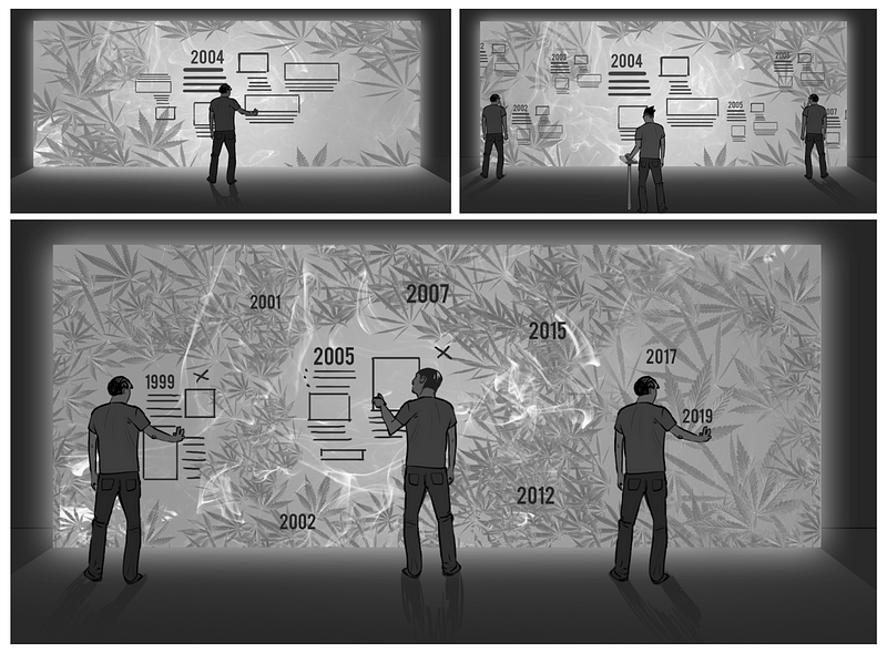
Our ideation landed on three options:
- When a user opened a year it would take over the entire wall and prevent other users from interacting (top left below).
- We would create a small scrolling stand that would allow a single user to move the timeline, with content being selected and expanded based on the middle year (top right below)
- Selecting a year would open a small area with content, and surrounding years would be pushed away — allowing multiple users to react at once (bottom below).
Given the museum space, and the fact we knew that multiple people could interact at once, we opted for option #3.
Creating the Build
Hardware: In order to project across 30 feet of wall, we opted to use three Kinects spaced out across the bottom of a wall. Since we could only use one Kinect per PC, we used three Intel NUCs (each corresponding with a Kinect) to relay Kinect data to a single rendering PC. Each NUC was calibrated to ensure that movement from the smoke and leaves would mirror the movements of users standing in front of the wall.
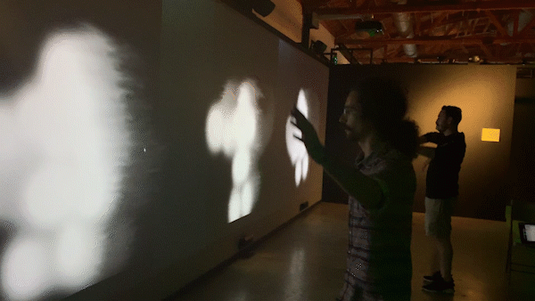
Software: For the visuals, a particle system for the leaves was started in Houdini before being finished in WebGL via a custom exporter. The smoke was a fluid simulation that would react to the outline of the user (as detected by the Kinect), spawning a fluid sim as users moved around.
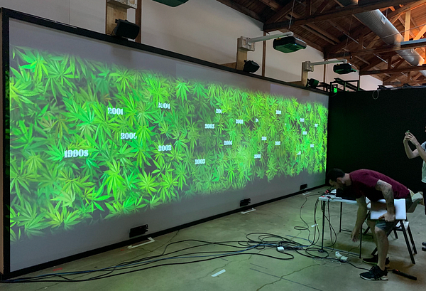
Testing on the hardware setup in our Venice office (left) and onsite in Hollywood (right).
Part Two : The Map Visualization
Located across the room from the interactive timeline, a map visualization would make up the other half of Exhibit 7. Similar to the timeline, the purpose of this visualization would be to demonstrate the social and political shifts regarding cannabis over recent decades.
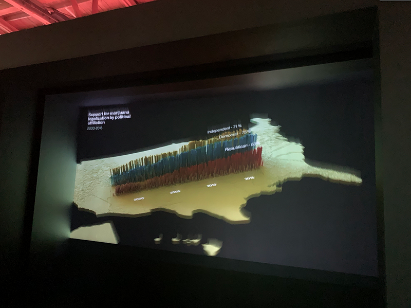
Finding Storytelling Data
Working with VICE, we searched for rich data sets that tracked interesting data across both time and geographic dimensions. Finding data with these different dimensions would allow us to create visuals where a camera would pan around different geographies of the United States, with data points being added over time.
Early Visual Exploration
From an early stage, it was decided that the visualizations were going to be abstract, and we wouldn’t attempt to create scale representations of the data.
With this in mind, we produced an early motion prototype based on an agreed upon creative direction. This showed geographic data changing over time, with camera zooms into hotspots, and would serve the creative foundation for the rest of production (pictured below).

Creating the Map
Given the map was going to be a looping video (and not real-time interactive like the timeline), we used a range of different tools and pipelines to create the final video output.
The majority of the animation was driven by shader effectors inside of Cinema4D. The effectors were fed textures representing data, which allowed us to control the position and color of thousands of particles to match the values in each data set.
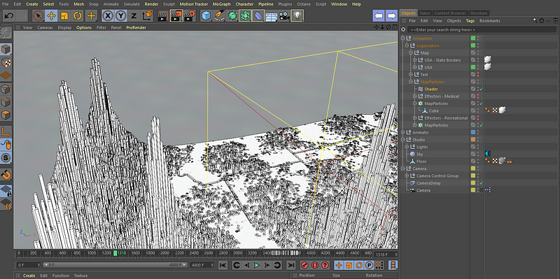
For the time-lapse clouds scattered about the scene, we ran a series of simulations inside of Houdini and exported them as looping VDB sequences, which could then be brought into C4D for the final render.
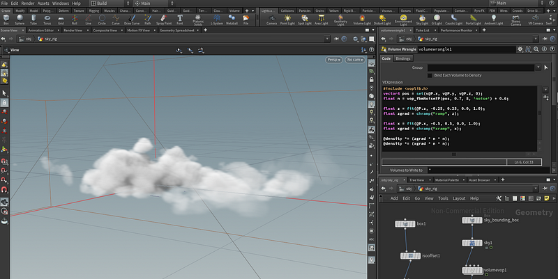
The final sequence was rendered using Octane, and then imported into After Effects for compositing. Camera data from C4D was used to place animated, 3D text overlays into scene for the final cut.
Alongside our interactive timeline at the #MuseumOfWeed installation, we created a map animation highlighting the social and legal evolution of cannabis in America
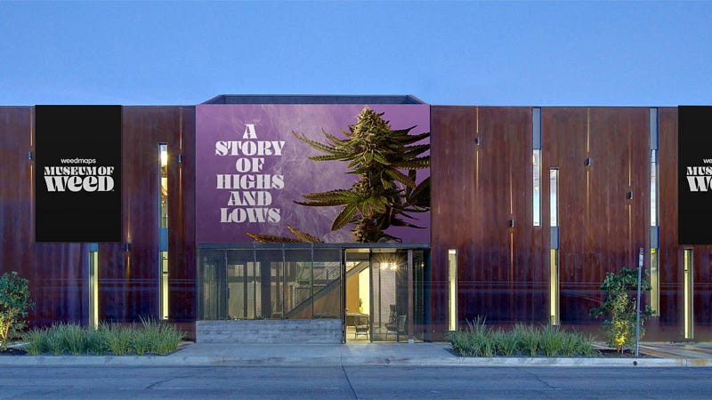
Launching in Hollywood
The Interactive Timeline and Map Visualization went live at the Museum of Weed in Hollywood. Since live, thousands of museum goers have passed through the exhibits and explored the cultural and political evolution of cannabis culture in the United States.
The Museum of Weed is open until 10/27/2019. More information is available on the official site here.
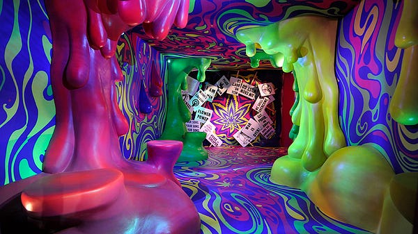
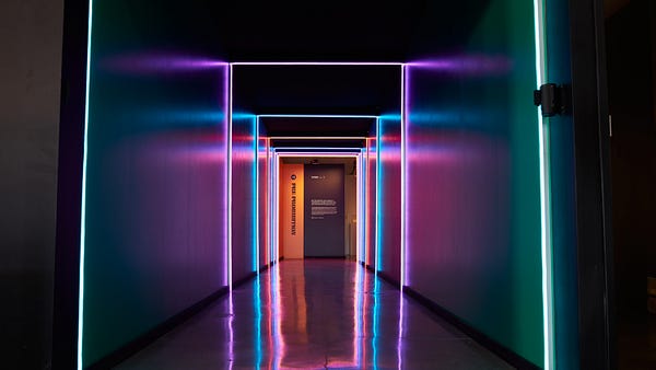
The museum featured fun, walkable exhibits in the lead up to Exhibit 7
Live at the Museum of Weed in Hollywood.