Xbox Halo
View the project: web
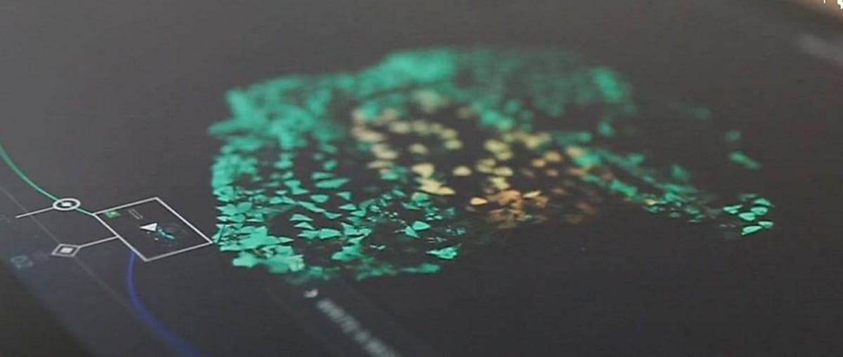
Coinciding with Halo 5’s live action trailer launches, social commentary and UGC were visualized using WebGL particles in the shape of iconic character helmets.
Interactive Lighting
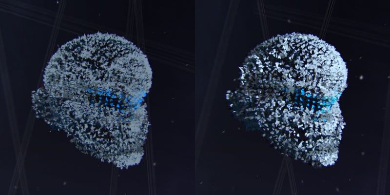
To keep the helmet of particles from feeling too flat, we made a real effort to add realistic lighting and shading to the particles’ color. This helped to make the image pop — here is a before and after demonstration.
As with everything we do, we love to add as much interaction to the experience as possible — otherwise you may as well just be watching a video.
On top of the main helmet interaction, there were two layers of interactive lighting added, both deriving from the input of the cursor, be it a mouse on desktop or touch on a device.
These included:
- A directional light, based on the angle and distance of the mouse from the helmet center: this means that when your cursor is above the helmet, the light will be shining down from above — likewise for all other angles.
- A point light, based on the particle’s distance from the intersection point of the cursor on the helmet: the particles in the immediate surroundings of the cursor would receive extra lighting, and gradually less over a distance — like holding a small flashlight to the helmet.
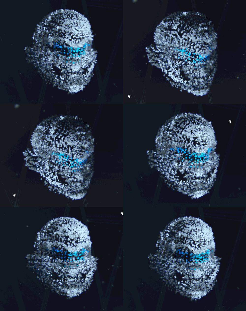
These kinds of interactions are not only visually pleasing, but make a considerable difference to the experience of the user, as they can really control the look of the site and explore the variations. People like to see that their input is being accounted for in some way, even if it’s just an aesthetic effect.
Post-processing
Again to push the realism and interest of the experience, many details were added in post-processing — meaning, on top of the helmet particles scene. This was achieved by creating WebGL shaders.
All of the procedures we used are attempts to somewhat recreate real-world visual effects from using a camera lens. These kinds of effects are very common in modern video games, and especially present in Halo. Therefore it made even more sense to add them to the experience.
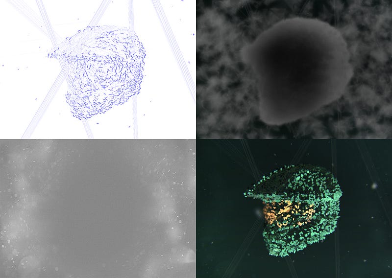
- Top Left: Chromatic aberration, in the blue channel only. This has been accentuated for clarity. Chromatic aberration basically refers to a slight shift in the red, green and blue channels of an image — becoming more apparent towards the edges. Only the blue channel was included in our experience for aesthetic reasons. This blue colour would be added on top of the original image. The strength of the shift was controlled partly by the speed of the rotation, being shifted further the faster the rotation, again adding another level of interaction.
- Top Right: Depth of Field blur map. This image works as a strength map for how blur is applied to the rendered scene. The blur is stronger in areas that are more white, and less in those that are black. The map is created by applying a different material to the elements in the 3D scene, and using this rendered image in conjunction with the scene itself. This effect creates depth by having differing levels of clarity in an image.
- Bottom Left: Dust overlay texture. This image is added to the final render, based on the brightness of the surrounding pixels beneath. For example if someone shone a light on a dirty pane of glass (such as a camera lens), the dirt particles would be highlighted. This is a basic version of this same effect.
- Bottom Right: Final composition — the sum of all of the images. Notice that the previous images are barely visible in the final result — the subtle differences add a striking overall effect and realism is improved considerably.
Timeline
As one of the main elements of the site, the timeline helped to give meaning and clarity to the fairly abstract experience. Therefore it needed to be as simple and easy to use as possible.

Although this is quite a simple-looking UI element, we still like to add subtle complexities wherever we can. We find it nearly always adds to the overall enjoyment of the interaction.
Below you can see how varying the location of the mouse changes the opening animation, making it open first in the area closest to the cursor, and then sequentially across the remainder of the curve.

Aligning 3D and 2D
When working with 3D interactive experiences, one of the most important aspects is the positioning of elements in regards to both two and three dimensions at the same time.
Below you can see several 2D elements that are placed around the 3D scene. Notice how the two main areas of text are not overlapping the 3D helmet, and are also not being cropped by the edge of the screen. This kind of thinking really takes responsive design to the next level.
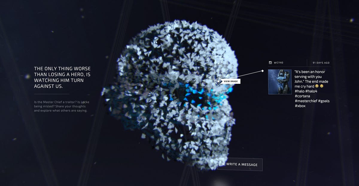
The key information is knowing where the edges of the screen are within the 3D space. This is related to what’s called a view frustum, which is a shape that encapsulates the entire visible space in three dimensions.
The technique we put into place was to place 2D CSS elements on top of the WebGL scene, but position, scale and rotate them so that they blend seamlessly with the 3D components. The reason for doing this is to harness the CSS text rendering engine, which makes working with text effortless.
Normally, the resolution of 3D applications on most devices is lowered in order to run the application smoothly, so when text is placed in the scene, it suffers the same fate and has visibly degraded quality. This isn’t always the case, however.
Below is an example of transitioning between a high resolution canvas layer placed on top, and a lower resolution scene where the text breaks into shards and merges with the helmet. The reason for doing so is that the text at the resolution of the scene was quite pixelated, and increasing the resolution of the entire scene would have slowed the performance.

Therefore the high resolution canvas stays visible for as long as possible, and then fades out as the scene text fades in, just before the shards starts to animate away.
The reason that we were able to line up a 2D and a 3D element so seamlessly was again thanks to knowing the frustum width and height.
Here is a graph outlining how to calculate the frustum size at any given distance. Think of it as a rectangle in 3D space that perfectly fits the entire screen.
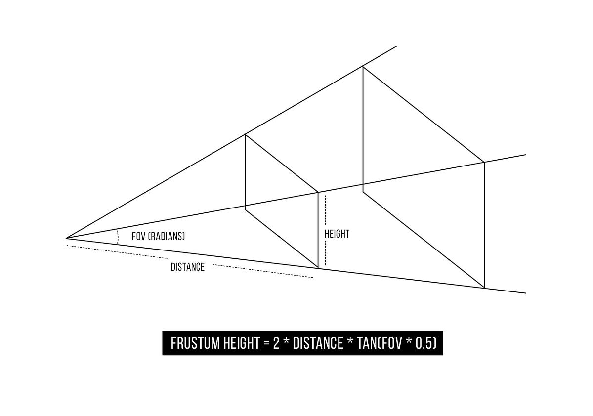
By using a camera’s Field Of View angle (FOV), it is quite simple to calculate the size of the frustum at any given distance.
In the quote text example above, the canvas took up 100% of the width of the screen. So in using this calculation, we were able to scale the 3D version of the text to the perfect size as to line up correctly, regardless of its distance from the camera.
This calculation can also be used to convert 3d positions (x, y, z) into the correlating pixel coordinates, and therefore place or adjust the positioning of elements.
Social Scraping
To capture the conversation surrounding the Halo 5 trailer launches, we created a custom social scraper that gathered content from across the web. Our tool pulled content from Twitter, Facebook, Youtube, and Instagram. And, knowing that the Halo audience would also be active on forums, we created custom content scrapers for the Halowaypoint forum, and Reddit.
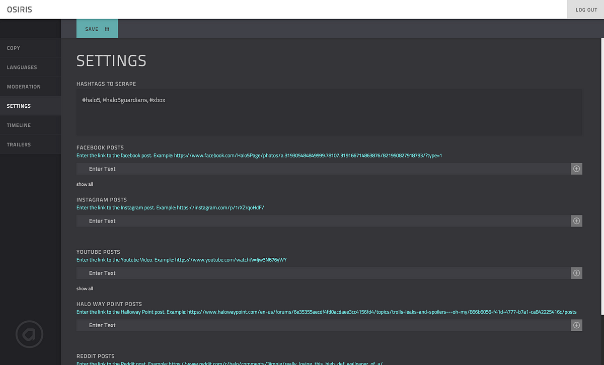
Moderators were able to update the Settings at any point, so that the content sources could be updated to capture wherever the chatter was happening.
Moderators could also handpick content on the site by prioritizing posts, and adding mixed media — Youtube videos and Instagram images.
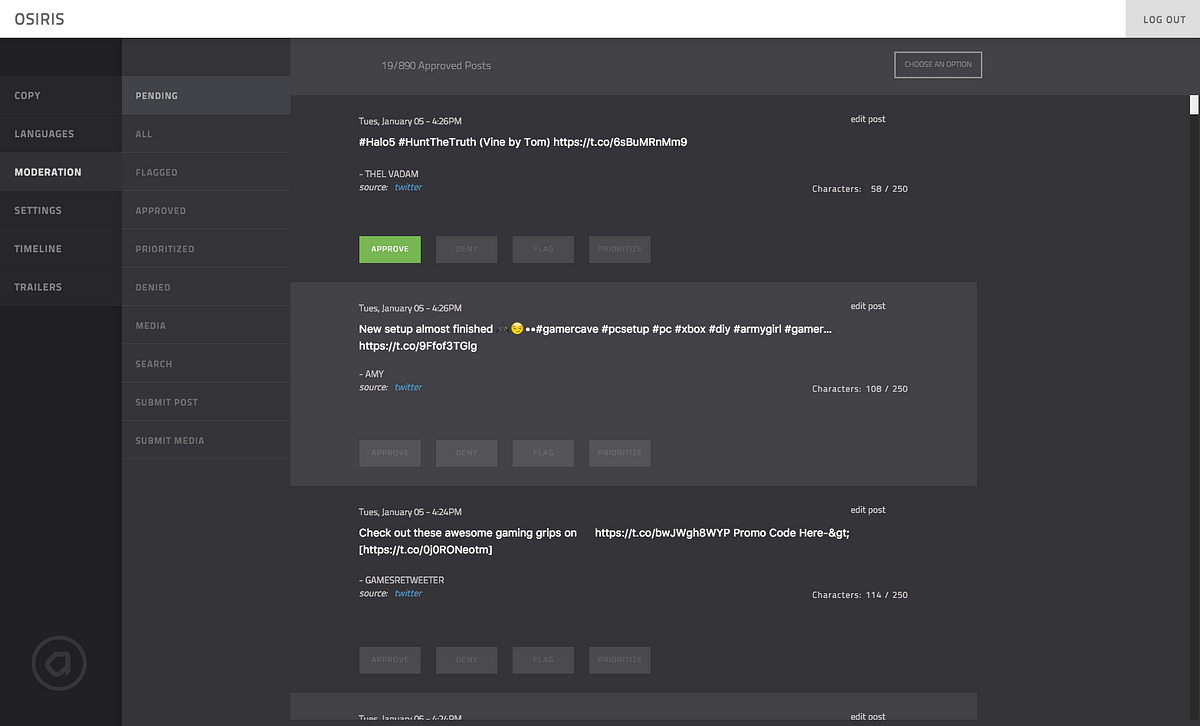
The moderation team worked around the clock during and days after the trailer releases, and moderated tens of thousands of pieces of content using our social scraper.
Device Optimization
One of the key benefits of building web applications is the broad spectrum of devices and screen sizes that they can run on. This does however create a really important design challenge.
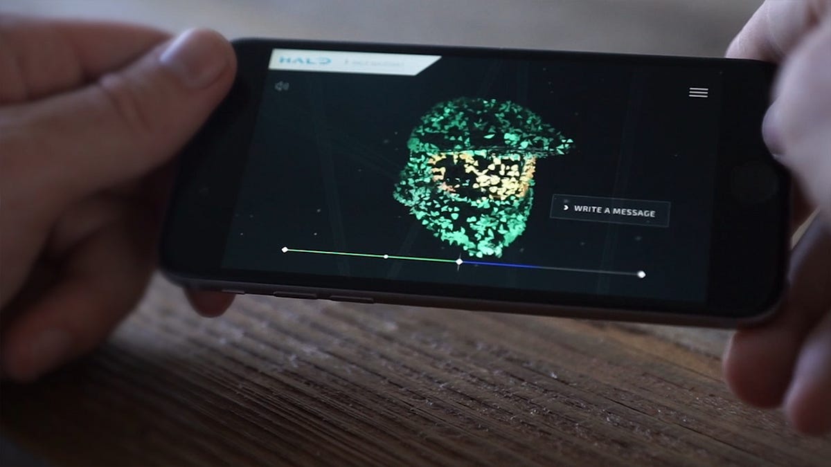
Our unique approach to this is that for any given element in the application, we create several customizable options in order to cater to differing levels of support.
For example, as WebGL capabilities differ greatly between devices, we created the ability to scale back the detail and complexity of the post processing effects, resulting in less calculations for the device to make.
In doing so, we can debug each device individually and customize each element to perform at an optimum level. New device capabilities and platforms are appearing all of the time, and following this structure we can easily tailor the experience to accommodate them as they arrive.
In Guardians Visualizer, there were a great deal of optimizations put in place. This can become very confusing if not done in a clean structure, as there are literally hundreds of possible variations of the final site — each purposed for a specific support level or purpose.
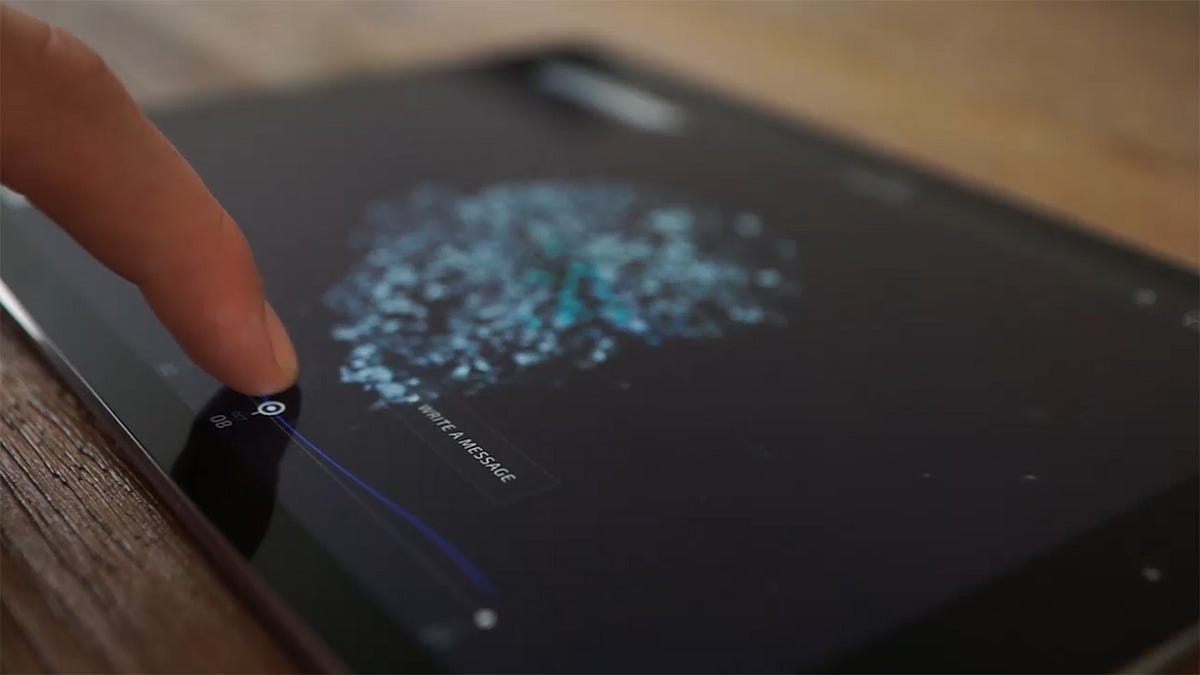
Although Responsive Design handles differing screen sizes well, we found that this thinking alone falls well short when an application has complicated functionality, as was the case with this project.
Developing complex web applications for a wide audience is a real challenge, however we are confident in our approach and feel it gives us a lot of freedom to tackle more complicated concepts while delivering high-end experiences.
